The poster above is the one i did first and used a quote from a movie (batman begins) and used a picture i took of a painting and placed it in the background to give the effect of a movie real using black lines also.
the poster bellow that is a more resent one where i have repeated the word ART and hi lighted the center word in red to give a focal point to the poster were your eye is drawn too.
the poster bellow is drawing pins and because they are pointy and you do Art too make a statement or point so i tried to play on words also pins are sharp and pointy.
The top poster of this pair is a rusted iron frame and the top layer has come away making it look like someone has purposely removed it i might however tweet this poster and make the writing sat Chip away at, the exterior rather then Chip away,the exterior. however i like the colour scheme i have chosen because they all work well together leaving the white to stand out.
The poster under its, is made of one word Creative made into the shape of a paintbrush i tried to replicate the colours and proportions as close as i could and with some helpful critiques i managed to get it as close as i could and it has turned out as one of my favourite pieces of work I've done this year.

 The top poster of this pair i wanted to try out a gradient effect with warm colours and i turned out okay for a practice piece but I'm not too keen on it as it comes across quite basic to me but the second poster is one of my favourites as it looks and feels professional in my opinion.
These are the posters i have created so far i have looked into typography and chosen a quote from a movie (the fist poster) i also created a couple using macro on the camera.
These are my newest posters using a photos i have taken using a macro lenses to get right into the detail and chosen a quotes "Put the pieces together,too get a clearer picture" and ''Look deeper into detail''.

 Top poster i like better then the one bellow because the photo is better and more artistic looking however i like the colours on the second because they work well together.
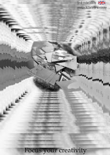
This image is created buy replicating the same image over and reducing them in size each time until you end up with a tunnel vision effect leading into s single image. i like this one but after a while it trips your mind out due to its blurred effect.


This is another typography poster similar to another poster i did
but i have took influence from other posters of sorts however this time it is all different colours aimed at younger people and makes people stop and look at it.
This poster is my newest and the pattern replicates the quote in the red blocks represent academia and industry and the white represents the bridge


No comments:
Post a Comment